I'm curious what's cognitively loading about three horizontal bars arranged in a square located in the corner of an app or website.
Screens, somewhat counterintuitively, used to be wider. Because they were not on handheld mobile devices. Then we had the menubar and nested dropdowns, suckerfish, etc. It was an exciting time to see a menu, you were never quite sure what you were going to get - I believe there are positives to learning curves for power users.
But I digress. 三 means 3 in Chinese. It doesn't take cognitive load. Why does a hamburger? I really am curious.
I use to know a gamer who used a phone for something like a decade. He got stuck doing something and I had to point out the burger to him. The thing he was looking for was interestingly enough not there. Apparently all websites he used were perfectly usable without knowing the button exists.
In contrast, some people can't not-read something and it being a button is automatically parsed out. Symbols and icons have to be learned which is a more gradual process. The other day I didn't recognize the flower icon for settings.
Three bars means... the exact same thing the thousands and thousands of times it's been seen before.
People have no inate understanding of 'menu'. We don't even read short words like that letter by letter, it's read as a block and is far more complex than three bars.
People spend years specifically learning how to read starting in early childhood. It's expected in the current era that people above a certain age are literate to at least some degree. People usually don't spend years specifically learning how to interpret icons except when they have to in an app or on a sign they run into.
"Menu" has a consistent meaning (a list of items to choose from) which most people can be assumed to know. Icons aren't as easily parsed and take more of a mental load to reason about them. Or just trial and error to figure them out.
I've seen too many variants of icons for "general" menu. Three bars, three dots, square, square in square, tall rectangle, gear, company logo and probably a few more.
And if we want to focus on just three bars let's not leave out the skeuomorphism trend where three bars meant the "grip" area, something to use to rearrange items or windows.
> Three bars means what, exactly? There’s the cognitive load.
This was true early on when it was not a common convention, or only used in mobile apps. Now, it is nearly universal, though still not nearly standard enough in placement or presentation.
If we were to redo history, it would've been great to see an expanding menu closely positioned by a top-left logo. Sort of like a Windows Start Menu for each website.
I couldn't agree more. The hamburger menu is in my list of the worst UI elements around. It has nothing good to recommend it.
It's barely tolerable in situations where screen space is at a premium, but it's still pretty awful.
> Its growing ubiquity helped standardize its meaning: Through repeated exposure, users learned to recognize and interpret the icon with increasing confidence.
Sure: it's the symbol of the "junk drawer" of the UI. Who knows what random assortment lurks in there? It's a place you go only as a last resort.
It wouldn't be fair to use "MENU", as not everyone speaks English, and regardless, many UIs aesthetically need an icon, so why not have standardized on one?
It's healthy to have decided on an icon, but I agree an ellipsis would've been (and still would be) intuitive too. Maybe designers trying to make their mark will start using ellipses in new designs... who knows.
Judging from the list of languages that have "menu" as a word (with a comparable definition to "menu"), I don't think it's a stretch for people to know what the word "menu" means: https://en.wiktionary.org/wiki/menu , it's not even originally an English word afterall.
You're assuming that it's an agreed and understood standard, which it really isn't. Tech savvy audiences often don't find it easy to understand that there are lots of people who don't understand things like this.
In terms of using MENU, if your audience is not English speaking then you can, and should, consider adding internationalisation and localisation as an alternative. If you have considered it for your content, it makes sense to consider it for your UI as well.
If the designer wants to encourage super-users and quicker access then splaying out all options is better. If they want "clean and tidy", the icon is better.
Heck, even when I have splayed out all the most-important options across the screen... where do I put the /rest/ of the menu options? in an "other" menu, likely drawn with 3 horizontal lines.
its true in many cases, those hold-everything menus end up has junk drawers that users have hard time navigating through, especially on mobile screens where not everything is shown at once AND the scroll indicator is by default hidden so its not obvious there are more items below the screen edge
No sorry - an ellipsis is the meatballs menu, not a hamburger. Different things. There’s also the kebab menu (also a different thing) and the fighting corn dogs menu …
A restaurant menu contains hamburgers, hotdogs, meatballs. A UI menu is represented by abstract icons of the items contained within a restaurant menu.
Now I am starting to like the hamburger menu after all… perhaps more as satire though. :)
For what it’s worth, ellipsis is the best of the bunch, because it means the same thing as in the written language, and is concise enough to use as a button that suggests what the action does.
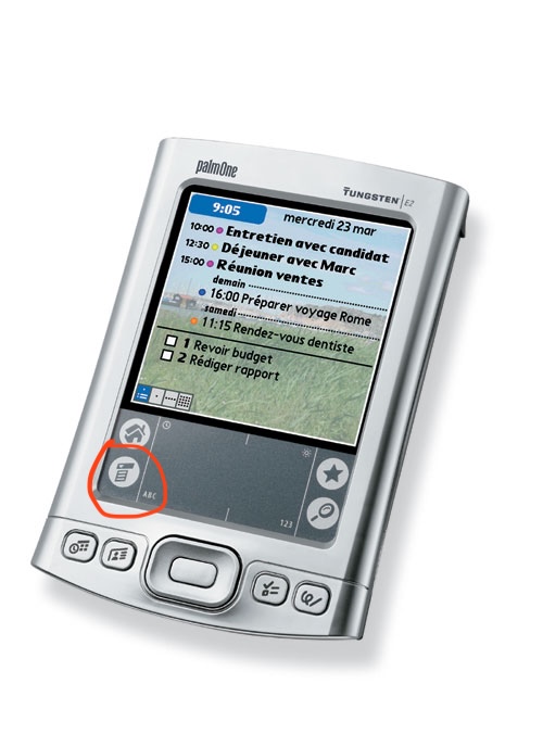
Even the palm pilot with its ridiculously tiny screen and bad touch ditigizer managed CUA-style menus.
Mobile UI design isn't about making things more understandable, it's about getting the user into a helpless and suggestible state so your ad impressions are worth more.
More than anything hamburger menu type design feels to me like an “avoid effort and skill as much as possible” sort of thing more than it does an “optimize ad revenue” sort of thing, as does flat design. It’s about lowering the bar for what’s acceptable to ship as far as you can possibly get away with. Plaster some scrolling flat rounded rectangles and a hamburger menu on the screen and boom you’ve got an app.
There is more than enough room for 4 menus across the top of a typical mobile device. If you expect the user to need to access it regularly, you could even put it across the bottom. This is why the homescreen on most phones has 4 items across the bottom; not a single hamburger menu with "Phone, Messages, Web, ..."
I'm curious, not a UI designer at all here, but what's so taxing about the hamburger? I grew up with it mostly always around and never even thought twice about it..
My problem with it mostly that it hides functionality. Seeing a hamburger menu gives you no insight as to what options exist under it.
The menu itself also tends to be a "grab bag" of multiple otherwise unconnected things, increasing the effort required to figure out how to do something.
I like to refer to them as junk drawers due to their messy nature.
Apps with hamburger menus also tend to have navigation that’s otherwise not well though out, think burying options in chains of modals where the paths to those options change whenever the app’s dev decides it wants to push a different feature/metric.
I like the "junk drawer" analogy. It's perfect. IMO if you as an app developer find yourself reaching for a hamburger menu, that's the time to step back and stop adding junk features, especially if you're writing a mobile app or web page. If you can't fit your application's critical functionality in, say, 4 tabs across the bottom of the app, the app is probably trying to do too much.
That’s often the case, but the other common problem is lack of consideration about hierarchy. It’s fine if every function of the app isn’t accessible with a single tap — that’s probably not necessary except for the app’s most pivotal functions, but most things should be able to be used within two taps and almost everything within three, with the paths being logical and predictable.
It’s plenty doable, but like I said it takes some sitting down and planning and perhaps more importantly, design centered around the user and their needs and less around looking pretty in a slideshow or trying herd the user around.
I know it's only anecdotal, but my mom doesn't get it. She's not super interested in her iPad and basically only uses it when she has to or for FaceTime. She'd be the perfect test subject for stress testing UIs and more interfaces than you'd think are doing a pretty poor job of explaining themselves. Not many icons are intuitive, hiding something in modal windows, muscle memory/dexterity and precision are all problem areas.
The hamburger is basically all of that rolled into one button. It's pretty abstract, you never know what's behind it and when they get fancy with animations and swipe gestures, it's almost always a failure.
I know it's a convenient way to clean up a screen, but the content in that menu needs to be absolutely optional for it to work.
As someone that has been learning new interfaces for the past 50-ish years as they randomly appear and mutate... I had no real idea what the icon might mean. Something that is stacked up that might drop down if I touch it? Could the lines mean a text document of some kind? Could it be a list of things? I got there eventually, but the word "menu" wouldn't have required any guessing on my part, for example. It was easier, though, than figuring out that the three vertical lines at the bottom of my android phone meant switch apps or that the rounded square meant "make the app go away, but don't kill it".
Because when I eat a hamburger, there isn't a whole restaurant inside it.
Nothing about the food suggests its function. And the function varies, it might be a whole rabbit-warren of menus and options. It might be a bunch of actions. It might just be one last item that wouldn't fit on the screen. It's an awful graphic for an awful concept. "We ran out of UI ideas so we just shoveled what was left into this junk drawer" is no way to go through life.
The implication of "load" is not that it's a huge hurdle, but just that it takes longer (even a tiny bit) for most users to visually assess what it means. Add up all those little delays, and you have a frustrated new user.
I regularly use a piece of software from IBM that has (this won't surprise you) an awful UI. There are not one but TWO hamburger menus, hidden amongst a bunch of text menu headings, and figuring out where the one you want is can be noticeably taxing. Explaining to another user where to click is even worse - "No, not that one, the one under the... to the right..."
> but just that it takes longer (even a tiny bit) for most users to visually assess what it means
Also as an example, three horizontal lines also sometimes get used as grips to indicate an element can be click-dragged around. It is less common than it used to be, though.
Any symbolic visual takes time for our brains to decode. When compared to language which we’ve spent our entire lives decoding and which comes much naturally, the cognitive burden is much higher.
In addition the three bars are as mundane of a composition as you can get, so it doesn’t capture the eye well to begin with. Typically the eye gets pulled to more visually complexity.
But ultimately it boils down to the decoding idea—language is the ultimate “codec” of human communication.
Isn't text a "symbolic visual"? I would think that at some point a symbol that's used as frequently as the hamburger icon would/could eventually become equivalent to the word.
> Typically the eye gets pulled to more visually complexity.
Written words have a "voice" - that part of your mind that recognizes something spoken. Hamburger menu icons don't have that, nor do they have the higher contrast or complexity that emoji have.
Also, it used to be important when screens were nowhere near as wide but now there’s no longer any reason to use it the way it is.
Perhaps it is permissible on a busy UI with many buttons, but that job was taken by the ellipses, which also takes less cognitive burden!